One commission I had this year was of a cat named Little One. This one was particularly special to do because it was my first Cat Commissioned piece. I’ve done cat paintings before, of my cats Micah and Rain, but never of others’. Not because I didn’t want to. But I just hadn’t been asked to do one, until Little One came along. I was usually asked to paint dogs. The pet parents of Little One happen to be fans of Mr. Rain, who follow him on Facebook. I share my artwork on his page along with his silliness and stories.
This painting ended up being a tremendous challenge for me, more so than I thought. I made the first mistake of not doing what I did with previous watercolor paintings: Test Mini Painting. Starting it out like that helps me to figure out what I should, and should not, do with the official painting. Instead, I went in headfirst into the official painting. In the end, I just was not happy with it. I got up to this point before I realized…. Ok this is not working out….
The first issue I had with it was the window. The original photo has a window behind him. And I thought it would add an interesting source of light. But in the end it was throwing me off. If the light is behind a subject, the back and outline would be brighter than the foreground subject. And that just won’t do to shine a light on the main subject. You want him to stand out. The window was just too distracting for me. The second issue I had was the overall color of the kitty boy himself. He was turning into a cartoon character with bold colors and that didn’t feel right. Was he an orange kind of cat? Sure. But not THAT orange. I had two photos to work with of him in that pose. One was the actual photo I was using, and the other was the same setting in a different perspective. The problem I ran into was that each photo had a different color saturation. The main photo was more bold and color saturated than the other one. I had a hard time determining which was the true color of Little One. Plus I made the mistake painting in the whites of his fur, instead of trusting the whiteness of the paper instead. It just all around looked amateurish to me.
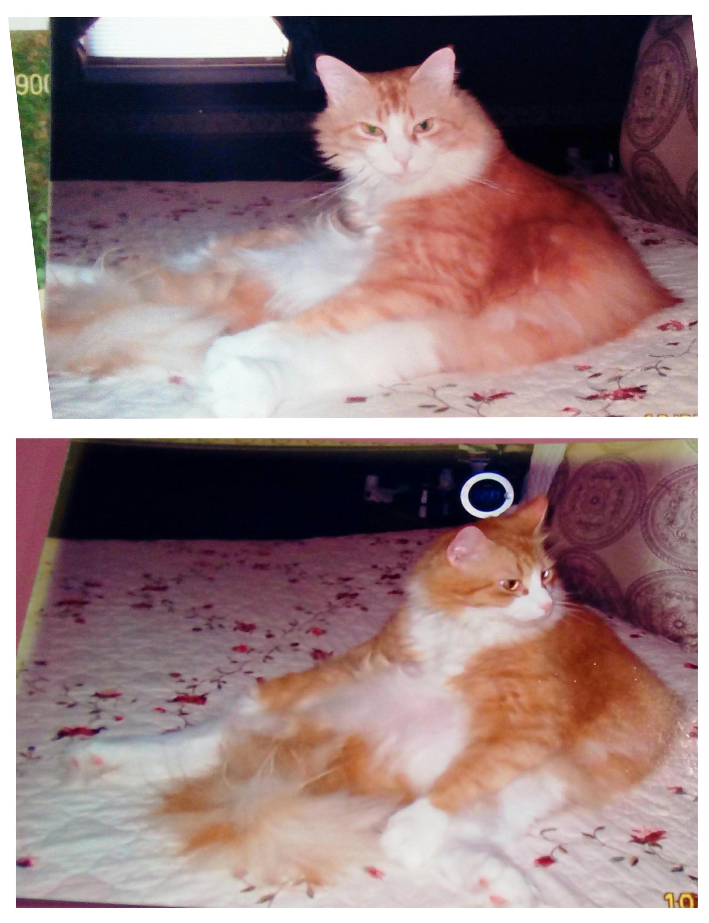
I don’t want to give someone something I am not happy with. So I decided that I needed to start over, from the very beginning. Jo, the pet parent of Little One, was gracious enough to be open to starting over. I needed clarifications on the true color of his fur, his eyes, favorite colors (which I ask everyone), if it was ok if I did this or that instead of where I was going before. She was very helpful in providing the details I needed. The original photo was a bit blurry and super-flashed, so I needed as much information as possible, however small it was.
Now I was armed with all that I need to know for sure. I had several references, provided by Jo, of cats with similar eye colors, as it was difficult to get a clear idea of his eye color in the original photos. My favorite eye reference photo was the very bottom photo of the floofy orange cat in the below photo collage. It just seemed to be the best reference for the eyes. The second photo in the above photo, where he is looking to the side, turned out to be more true to his fur color, so I had to continuously refer to that to keep myself as consistent as possible. The kitty in the below photo with the tie is also of Little One, but with fur that was cut short, which revealed a lighter undercoat.

This time, before starting the official second painting of Little One, I did a mini test. I was not trying to do a complete mini test painting. Just until I got the point where I had a plan of how to go about painting this kitty boy. I felt more confident about this new direction, and set out to start over on the second painting.
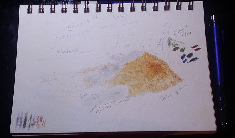
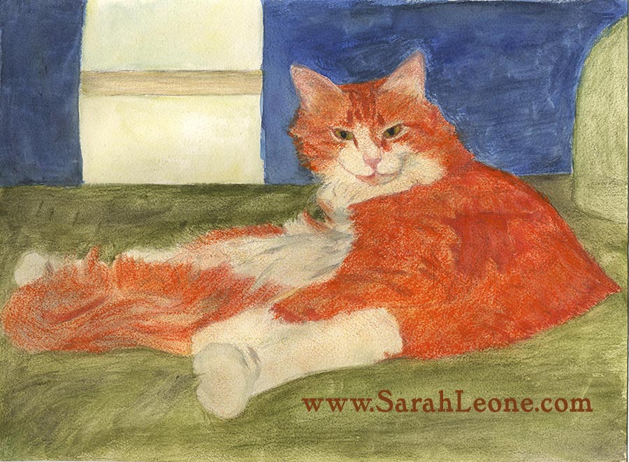
As you saw in my first painting, I had selected a blue background. I thought having a cool color would go well against the warmth of the overall colors of the painting. So I continued on with that concept into the second painting.
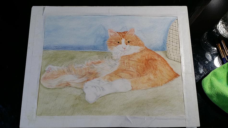
But the more I worked on it, the more something bothered me. And I couldn’t figure out what it was exactly, until I took a step back and later took a glance. Then it came to me. Oh, the background color feels out of place! Oh shoot lol. No way I was going to do a third painting of Little One :p So I had to figure out how to turn the cold wall into a warm wall. I tried out various things that didn’t do very much. But after awhile I decided to just jump into it and start adding a warm grey/pale brown diluted color tones in watercolor and polychromos colored pencils. It turned out more like a….warm grey with a ting of blue glow…? Which ended up being the right call since grey was Jo’s favorite color haha (which I knew ahead of time, but I kind of forgot until I was almost finished with the painting…). I wasn’t even thinking about that when I went in that direction, so it’s kinda cool how it worked out in the end. It also made Little One stick out more, I think. It gives it a warm cuddly feeling that was almost lost with the cool of the blue.
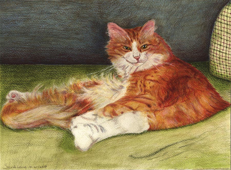
“Little One”
9.7×13.1 inches
Traditional Mixed Media painting using Faber-Castell polychromos colored pencils, Sennelier watercolors, Sennelier soft pastel chalks, and a Uni-ball Signo UM-153 gel pen on Cold Press paper.
While I was painting Little One, I was also recording videos of myself painting. I had to fiddle around with finding the right spot to position a tripod and learn to let go of that awkwardness of ‘being watched’ on video. I normally stop to take photos of my progress and make a slideshow of it, but I got tired of stopping every few minutes to take a photo, so I decided it was time to solve the video footage mystery. The videos I took of me painting Little One aren’t that great, but it was a good learning experience. After finishing Little One, I started doing some research and, mostly on YouTube, I learned how people record themselves doing artwork, or how-to videos like in cooking or crafts or unboxing stuff. It was actually pretty cool and ingenious. I ended up getting a tripod that offered more flexibility in movements and reorganized my work-space that is more efficient and feels more like an artist work-space that I can focus in. I had a hard time with that before. So, maybe you’ll see a different kind of art video from me someday. I make no promises 🙂
Jo and her husband were very very happy with it, especially when they saw it in person. What do you think of the painting of Little One?
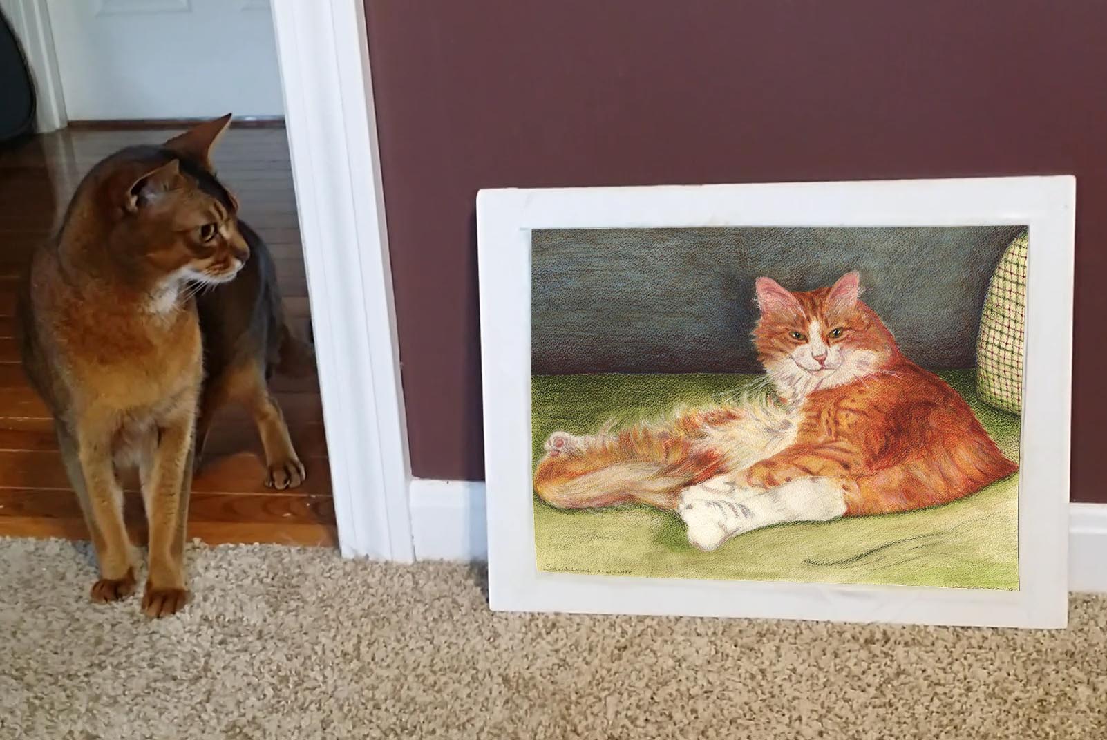
Mr Rain doing his own bit of critiquing. I wonder what he’s thinking………
Sarah, you still amaze me w/all your beautiful, amazing, fantastic paintings, that are done right from the bottom of your heart! Never give up! Do what you love doing each and everyday. From your great aunt Gloria, Big Bear Calif.
Final product looks amazing. The likeness of Little Ones’s expression is so life-like. You are very talented , Sarah! Andrew
I really like how the painting turned out! Great job! ❤️
I loved reading the history of creating little one, it makes one appreciate the art even more. There is such a contrast between the first and second piece. Your final piece is beautiful, I especially like little one’s fur, and the background truly brings warmth to your subject. Excellent piece Sarah!
Thank you Aunt Gloria 🙂 Very sweet of you to say^^ <3
Glad you like it Andrew! 😀
Thanks, Susan! 🙂
Dana Leone: Thanks Mom! I’m glad you love it! 😀